In an era defined by complex relationships and interconnected systems, understanding how entities relate to one another has become a critical skill across industries. From social media interactions and biological pathways to cybersecurity threats and financial transactions, network data reveals patterns that traditional spreadsheets often conceal. This is where graph visualization tools like Gephi play a transformative role, turning abstract connections into intuitive, interactive visual maps.
TLDR: Graph visualization tools like Gephi help users explore and analyze complex network data by transforming relationships into visual, interactive graphs. They allow researchers and analysts to detect patterns, clusters, and influential nodes that are difficult to identify in raw data. With powerful layout algorithms, filtering features, and metrics analysis, Gephi makes network exploration accessible and insightful. These tools are widely used in social network analysis, cybersecurity, biology, marketing, and academic research.
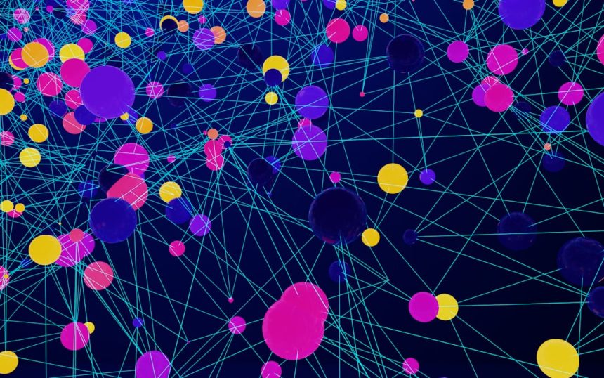
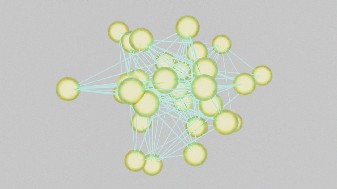
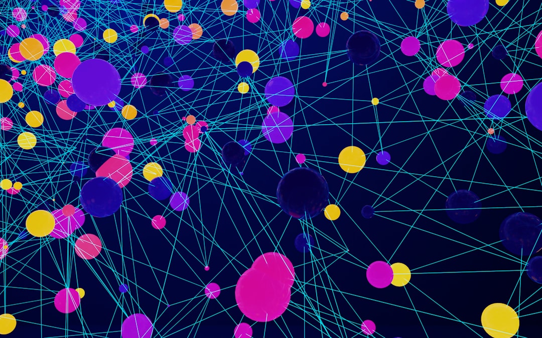
Unlike standard data visualization platforms focused on charts and dashboards, graph visualization software specializes in representing relationships. Nodes represent entities, while edges display the connections between them. The result is a dynamic structure capable of revealing hierarchy, influence, communities, and anomalies at a glance.
Understanding Network Data
Network data consists of entities (nodes) and the relationships (edges) that link them. This model can represent an astonishing variety of systems:
- Social networks: People connected by friendships or interactions.
- Biological networks: Proteins interacting within cells.
- Web networks: Websites connected by hyperlinks.
- Transportation systems: Cities connected by routes.
- Cybersecurity mapping: Devices linked by communications.
Traditional data tools often struggle to represent relationships effectively. Tables can list connections, but they rarely make patterns obvious. Graph visualization tools solve this problem by presenting data visually, enabling users to immediately detect hubs, clusters, outliers, and bridges.
What Makes Gephi a Popular Choice?
Gephi has become one of the most recognized open-source graph visualization platforms. It is widely used in academic research, investigative journalism, business analytics, and digital humanities projects.
Its popularity stems from several core strengths:
- Interactive visualization: Users can zoom, filter, and manipulate networks in real time.
- Layout algorithms: Built-in options such as ForceAtlas and Fruchterman-Reingold automatically arrange networks for clarity.
- Statistical metrics: Centrality, modularity, clustering coefficients, and path length calculations are readily available.
- Custom styling: Nodes and edges can be colored and resized based on attributes or metrics.
- Scalability: Handles small graphs and moderately large datasets effectively.
Unlike static diagrams created manually, Gephi allows iterative exploration. Analysts can tweak parameters, apply filters, and instantly see how the structure changes. This feedback loop makes it especially useful in exploratory research.
Core Concepts in Graph Visualization
To fully leverage tools like Gephi, users should understand several foundational concepts:
1. Nodes and Edges
Nodes represent individual items such as users, servers, or genes. Edges represent relationships between them. Edges may be directed (one-way) or undirected (mutual).
2. Centrality
Centrality measures indicate importance within a network. Common types include:
- Degree centrality: Number of direct connections.
- Betweenness centrality: Frequency of acting as a bridge between nodes.
- Closeness centrality: Average distance to all other nodes.
3. Modularity and Communities
Community detection algorithms identify clusters of nodes that are more densely connected internally than externally. These clusters often represent functional groups.
4. Layout Algorithms
Layout algorithms determine how nodes are positioned. Force-directed layouts simulate physical attraction and repulsion forces to naturally group related nodes together.
Applications Across Industries
Graph visualization tools extend far beyond academic research. Their applications are both broad and impactful.
Social Media and Marketing
Brands analyze influencer networks to identify key opinion leaders. By examining centrality scores, companies can determine which individuals have wide reach or bridging influence between communities.
Cybersecurity
Security analysts map device communications to detect anomalies. Suspicious nodes with unusual connection patterns can signal compromised systems or lateral movement attacks.
Healthcare and Biology
Researchers use network graphs to study protein interactions or epidemiological spread. Identifying central nodes in disease transmission networks can inform intervention strategies.
Financial Fraud Detection
Transaction networks uncover hidden relationships between accounts. Visualization reveals circular transactions, coordinated clusters, or abnormal hubs.
Academic Research
Citation networks illuminate the evolution of scientific fields. Scholars can identify influential publications and emerging research communities.
Benefits of Visual Network Exploration
Graph visualization offers several advantages over purely numeric analysis:
- Pattern recognition: Humans detect visual patterns rapidly.
- Interactive exploration: Filters reveal specific subsets of interest.
- Improved storytelling: Stakeholders grasp insights more easily.
- Anomaly detection: Irregular nodes stand out visually.
- Relationship clarity: Interdependencies become obvious.
Rather than scanning rows of data, analysts can explore relationships holistically. This visual cognition often leads to faster hypothesis generation and insight discovery.

Limitations and Challenges
Despite their strengths, graph visualization tools are not without limitations.
- Scalability: Extremely large graphs can become cluttered and computationally heavy.
- Interpretation bias: Visual arrangements may imply meaning beyond actual metrics.
- Learning curve: Understanding metrics and layout tuning requires time.
- Overcrowding: Dense networks can suffer from “hairball” visualizations.
To address these challenges, experienced users combine automated layouts with filtering techniques, subgraph extraction, and metric-based styling. Visualization works best when paired with quantitative analysis rather than replacing it.
Best Practices for Using Gephi
Professionals working with Gephi often follow these guidelines:
- Start with clean data: Remove duplicates and irrelevant edges.
- Choose the right layout: Experiment with force-directed algorithms for clarity.
- Apply metrics early: Size and color nodes based on centrality or modularity.
- Filter strategically: Reduce clutter by focusing on high-value connections.
- Validate visually and statistically: Confirm visual patterns with numerical evidence.
Combining design sensitivity with analytical rigor ensures that visualizations are both attractive and meaningful.
The Future of Graph Visualization
As datasets grow increasingly interconnected, graph visualization is becoming an essential analytical discipline. Emerging trends include:
- Real-time network monitoring for cybersecurity and financial systems.
- Integration with machine learning to detect communities and predict link formation.
- Web-based interactive graph tools for collaborative analysis.
- 3D and immersive visualization for complex networks.
Artificial intelligence is also enhancing network exploration by suggesting meaningful clusters, ranking nodes by predictive importance, and automating anomaly detection. In this evolving landscape, tools like Gephi remain foundational, offering transparency and hands-on control.
Conclusion
Graph visualization tools such as Gephi empower analysts to move beyond flat tables and into multidimensional relational analysis. By transforming connections into visible structures, they expose hidden communities, influential actors, and structural weaknesses. Whether applied in marketing, healthcare, finance, or cybersecurity, these tools provide clarity in complexity. As interconnected data continues to expand, graph visualization will remain an indispensable component of modern analytical practice.
FAQ
-
What is Gephi primarily used for?
Gephi is used to visualize, explore, and analyze network data. It helps users identify patterns, clusters, and influential nodes in complex relational datasets. -
Is Gephi suitable for beginners?
While Gephi has a learning curve, beginners can start with basic layouts and metrics. Many tutorials and community resources make it accessible. -
What types of files does Gephi support?
Gephi supports formats such as CSV, GEXF, GraphML, and other standard network data formats. -
Can Gephi handle very large networks?
Gephi performs well with small to moderately large networks. Extremely large datasets may require preprocessing or specialized big-data tools. -
How does graph visualization differ from traditional charts?
Traditional charts show distributions and comparisons, while graph visualization focuses on relationships between entities. -
Are there alternatives to Gephi?
Yes, alternatives include Cytoscape, Neo4j visualization tools, and various web-based graph platforms depending on the use case.