Color grading is one of the most powerful steps in the post-production process. It transforms flat or unbalanced footage into a polished, cinematic visual experience that communicates mood, tone, and professionalism. DaVinci Resolve is widely regarded as the industry standard for color grading, used in everything from YouTube productions to Hollywood feature films. If you want consistent, high-quality results, learning a structured and disciplined workflow inside Resolve is essential.
TLDR: Color grading in DaVinci Resolve follows a clear step-by-step workflow: organize your project, perform primary correction, adjust exposure and white balance, refine with secondary corrections, and finish with creative grading. Always correct first, stylize second. Use nodes efficiently and rely on scopes rather than your eyes alone. A structured process ensures consistent, professional-quality results.
Step 1: Set Up Your Project Properly
Before touching any color controls, proper project setup is critical. Inconsistent settings can cause problems later that are difficult to fix.
Start by:
- Opening your project in DaVinci Resolve
- Navigating to Project Settings (gear icon bottom right)
- Setting your timeline resolution and frame rate
- Configuring color management
Under Color Management, you can choose between:
- DaVinci YRGB (manual control)
- DaVinci YRGB Color Managed (automated color space handling)
For beginners, Color Managed is often safer, especially if working with log footage. Make sure your input color space matches your camera and your output color space matches your delivery format (usually Rec.709).
Step 2: Organize Footage and Build a Node Structure
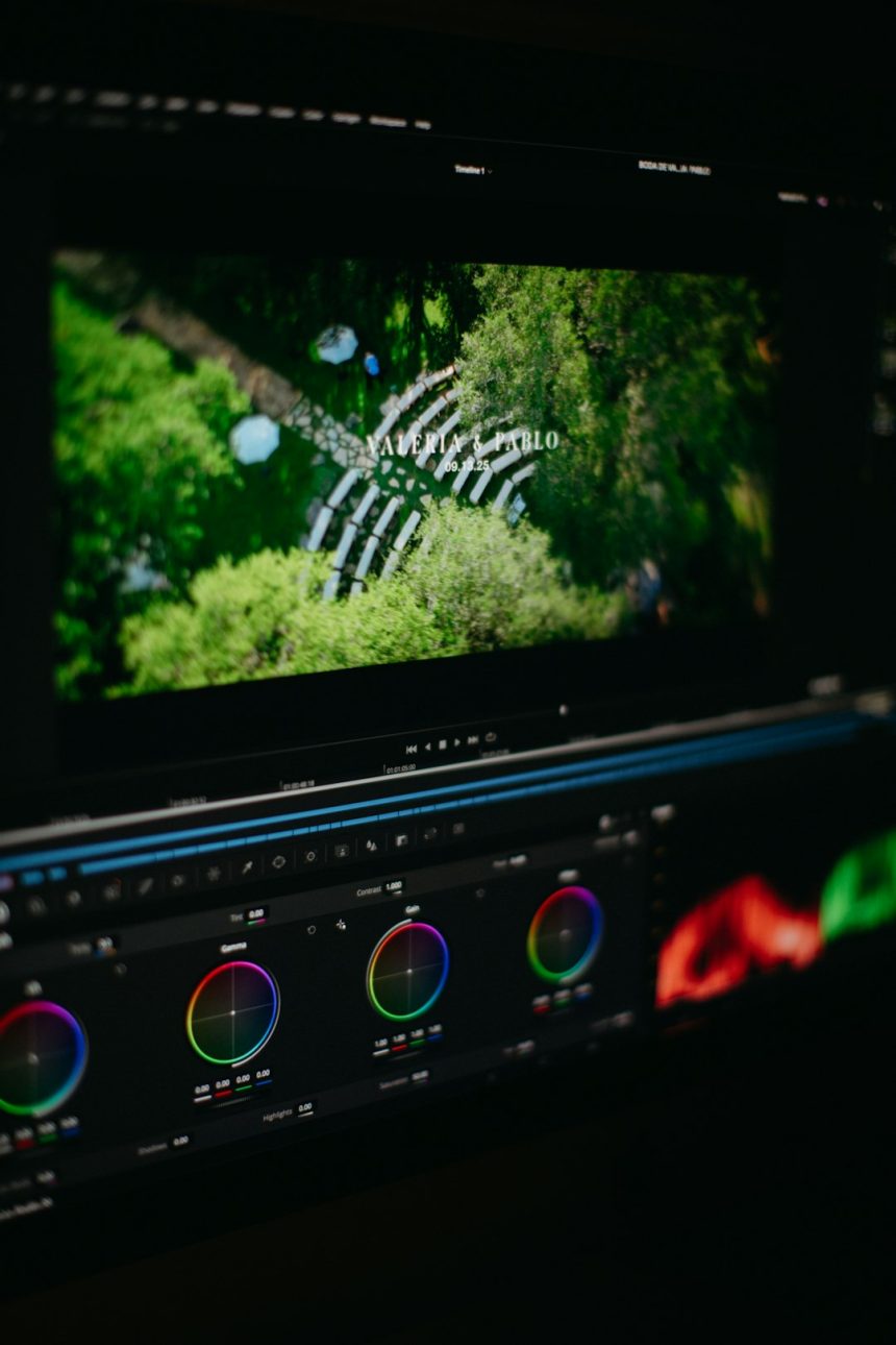
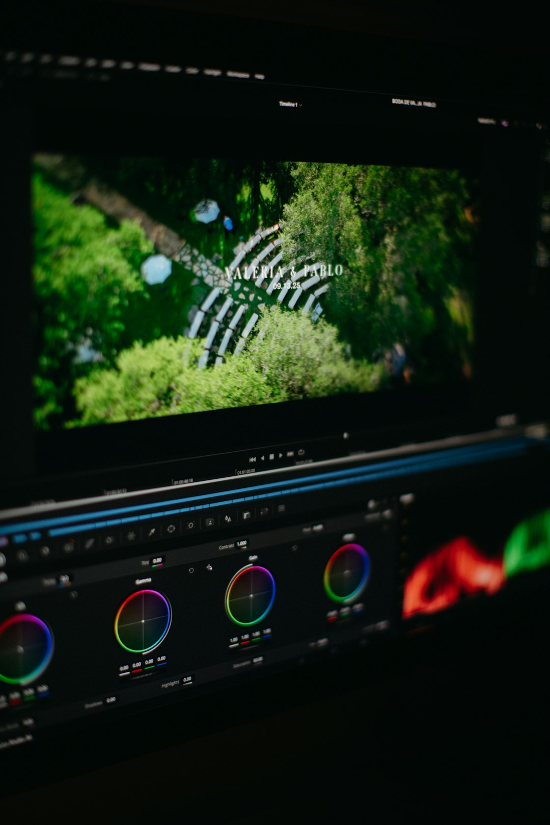
Move to the Color Page. This is where grading happens. Unlike other editors, Resolve uses a node-based workflow instead of layers.
Image not found in postmetaA recommended basic node structure looks like this:
- Node 1 – Noise Reduction (if needed)
- Node 2 – Primary Correction
- Node 3 – Secondary Corrections
- Node 4 – Creative Look
- Node 5 – Final Adjustments
Keeping corrections separated into nodes allows flexibility and control. To add a node, press Alt + S (Option + S on Mac).
Professional advice: Always correct technical issues before adding stylistic looks.
Step 3: Analyze Using Scopes, Not Just Your Eyes
Many beginners rely solely on their monitor. This is a mistake. Lighting conditions and display calibration vary, but scopes provide objective data.
Open scopes by clicking Workspace > Scopes. Focus on:
- Waveform – Shows exposure levels
- Vectorscope – Shows color saturation and hue
- Parade – Shows RGB channel balance
Your goals during correction:
- Blacks near 0 (but not crushed)
- Highlights below clipping (around 1023 in 10-bit)
- Balanced RGB channels unless creatively intended
Step 4: Perform Primary Color Correction
Primary correction fixes exposure and white balance issues. This step creates a neutral, balanced image before applying a style.
1. Adjust Lift, Gamma, and Gain
- Lift adjusts shadows
- Gamma adjusts midtones
- Gain adjusts highlights
Use the waveform monitor while adjusting:
- Lower Lift to anchor blacks
- Raise Gain to properly expose highlights
- Fine-tune Gamma for skin tones
2. Correct White Balance
If footage looks too warm or cool:
- Adjust Temperature slider (blue to orange)
- Adjust Tint slider (green to magenta)
Alternatively, use the white balance picker to select a neutral gray area.
3. Set Contrast and Pivot
The Contrast slider increases overall separation between shadows and highlights. The Pivot determines where that contrast is centered.
Avoid over-contrasting. Professional grades preserve detail.
Step 5: Secondary Color Corrections
Secondary corrections isolate specific parts of the image—such as skin tones, skies, or backgrounds—without affecting the entire frame.
1. Qualifier Tool (HSL Selection)
Use the Qualifier tool to select a specific color range.
Example: To refine skin tones:
- Select the Qualifier
- Sample the skin
- Refine selection using Hue, Saturation, and Luminance sliders
- Blur the mask to soften edges
Pro tip: Check the selection by pressing Shift + H to highlight the mask.
2. Power Windows
Power Windows allow targeted corrections within shapes (circle, square, custom shapes).
Common uses:
- Brightening faces
- Darkening backgrounds
- Adding subtle vignettes
Track moving subjects using the Tracker tool so the window follows the motion automatically.
Step 6: Creative Color Grading
Once footage is technically correct, you can build a creative look.
1. Adjust Color Wheels for Mood
Classic cinematic technique:
- Push shadows slightly toward teal
- Warm up highlights toward orange
This creates contrast between subject and background.
2. Use Curves for Precision
The Custom Curves panel allows detailed tonal shaping.
- Create subtle S-curve for contrast
- Use Hue vs Hue to shift specific colors
- Use Hue vs Sat to reduce overly vibrant tones
Curves offer more refined control than basic wheels.
3. Add LUTs Carefully
LUTs (Lookup Tables) apply predefined looks. However:
- Never rely solely on LUTs
- Always correct footage first
- Lower Key Output Gain if LUT is too strong
Professionals treat LUTs as a starting point, not a final solution.
Step 7: Fine-Tune Skin Tones
Human perception is highly sensitive to skin tones. Even small deviations appear unnatural.
Use the Vectorscope and ensure skin tones align along the “skin tone line.”
If needed:
- Isolate skin using Qualifier
- Subtly adjust Gamma color wheel
- Reduce oversaturation
Natural skin tones are rarely overly saturated or overly contrasty.
Step 8: Add Depth and Separation
Professional grading often focuses on depth rather than extreme stylization.
Methods to add depth:
- Subtle background darkening
- Slight desaturation of non-subject areas
- Sharpen midtones carefully
- Add slight vignette
Avoid obvious or aggressive effects. Subtlety distinguishes professional work.
Step 9: Match Shots for Consistency
If grading multiple clips in the same scene:
- Choose one hero shot
- Grade it completely
- Use Color Match or Copy/Paste Grades
- Adjust manually for perfection
Lighting and angles vary slightly, so final tweaks are always necessary.
Check transitions between clips to ensure brightness and color consistency. Sudden exposure jumps undermine quality.
Step 10: Final Checks Before Export
Before rendering:
- Review full timeline playback
- Check scopes for clipping
- Ensure legal broadcast levels if required
- View on a different monitor if possible
Small problems often become noticeable only during full playback.
Finally, go to the Deliver Page, choose your codec and export settings, and render.
Common Mistakes to Avoid
- Overusing saturation
- Crushing shadows excessively
- Relying entirely on LUTs
- Skipping scopes
- Applying creative looks before correction
Professional color grading is controlled and intentional—not dramatic for its own sake.
Conclusion
Color grading in DaVinci Resolve is a structured process that blends technical precision with artistic judgment. By following a step-by-step workflow—proper setup, primary correction, secondary refinement, creative grading, and final adjustments—you ensure consistent and professional results. Use nodes strategically, rely on scopes rather than assumptions, and always prioritize balance before style.
DaVinci Resolve is powerful because it gives you full control. With discipline, attention to detail, and practice, you can achieve cinematic results that elevate any project. Effective color grading is not about extreme looks—it is about clarity, depth, mood, and visual storytelling.