Colors make you feel something. A bright yellow can brighten your mood, while cool blue might calm things down. For logos, colors do more than look pretty—they send messages. But choosing the right color system for your logo can be tricky, especially when printing or going digital.
TL;DR
There are lots of ways to set up colors for logos depending on how and where you’ll use them. Print colors need different handling than digital ones. Understanding the 13 logo color systems will help you make sure your branding looks amazing—and consistent—everywhere. This guide makes it all super easy!
1. CMYK (Cyan, Magenta, Yellow, Black)
This system is used for print. It mixes cyan, magenta, yellow, and black inks to create colors on paper. CMYK is what printers love.
- Best for: printed brochures, business cards, flyers
- Not great for: web design
2. RGB (Red, Green, Blue)
RGB is for screens—your phone, your laptop, even your smart fridge.
- Best for: websites, social media, digital ads
- Not great for: print jobs
RGB colors are vivid and bright. Perfect for catching eyeballs online!
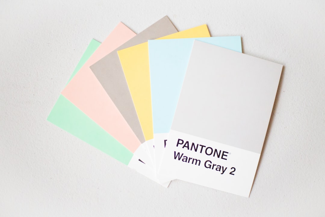
3. Pantone (PMS – Pantone Matching System)
Pantone is the grandma of color consistency. It uses codes, so designers and printers across the world know exactly which red you want.
- Best for: logos that must look the same everywhere
- Gets expensive in printing—but totally worth it!
4. Hex Codes
Hex codes look like this: #FF5733. You’ll find them in web design. They’re six-digit color codes used in HTML and CSS.
- Best for: websites, email templates, and apps
- They match with RGB values
5. HSL (Hue, Saturation, Lightness)
HSL is a more human-friendly way to describe colors. It’s great for digital designers who want to tweak hues just right.
- Best for: UI/UX design, CSS styling
6. HSB (Hue, Saturation, Brightness)
HSB is similar to HSL, but replaces “lightness” with “brightness.” It’s common in programs like Adobe Photoshop.
- Best for: design software, creative edits, color exploration
Imagine turning up the brightness like a lamp—you get the idea.
7. Lab Color (CIELAB)
This system is super accurate. Lab is designed to work like human vision, and can describe every color the human eye can see.
- Best for: professional photography, high-end design
- Can convert to CMYK or RGB for final use
8. Greyscale
Sometimes, you’ll need a logo that works in just shades of grey. Why?
- Black-and-white printing
- Minimalist branding
A clean greyscale version means your logo is still sharp and readable wherever it appears.
9. Black-Only Version
It’s useful to have a pure black version of your logo. No frills, no color tricks.
- Used for: stamps, faxes, engravings, or laser printing
- Ensures your brand stays visible even in low-quality reproduction
10. White-Only or Knockout Version
Ever see a logo on a dark background that’s all white? That’s this one.
- Best for: dark-themed websites, night modes, clothing prints
This version pops when colors can’t.
11. Transparent Background
A transparent logo file lets you put your logo anywhere—on top of images, colors, patterns, and more.
- Usually saved as: PNG, SVG
- Vital for flexibility
You don’t want your fancy logo trapped in a white box, right?
12. Duotone
Duotone is a vibrant mix of two colors. It gives your brand flair and can be stylish for social media or presentations.
- Best for: bold marketing, background images
- Trendy and eye-catching
13. Monochrome
Monochrome uses just one color, but in different shades. Think elegant, clean, and sophisticated.
- Best for: modern branding, high-contrast visuals
It gives you flexibility without the chaos of full color.
Bonus Tips for Choosing Your Logo Color Systems
- Always test your logo color versions—print them and view them on screens.
- Keep a brand color guide handy with all the codes: CMYK, RGB, HEX, Pantone, etc.
- Use scalable formats like SVG and vector PDFs for best color integrity.
Why All This Matters
Your logo is your brand’s face. If the colors shift and change from screen to print or app to ad, you lose consistency. And consistency is trust.
That’s why designers often create color variations and systems for logos. Not because it’s fun (although it is!), but because your brand deserves to shine in every setting.
With these 13 logo color systems, you’ve got every angle covered.
Quick Visual Comparison
Here’s a simple way to imagine the uses:
| Color System | Use Case |
|---|---|
| CMYK | Printed materials |
| RGB | Digital screens |
| Pantone | Brand consistency, print |
| Hex | Web and apps |
| Greyscale, Black, White | One-color print, branding |
Final Thoughts
Pick the right logo color systems from the start. It saves you headaches later.
Make sure your designer delivers all important versions. Ask for CMYK, RGB, HEX, and transparent backgrounds.
Your colors aren’t just decoration—they’re communication.
So go color your brand… wisely and wonderfully!